Pages

Monday, November 29, 2010

Sculpting Time Update!

This is a huge leap ahead in my sculpt, parts of the legs and torso actually look close to finished.
I still need to get the gun attached and finish the arms but once I got detailing I couldn't stop...

I cut away a lot of the excess sculpey from the base partly because I needed some more and so that I could have a complimentary shape on the ground instead of just an entirely covered platform. I will paint the sculpey grey and maybe paint the base black just for some contrast. It will be easier to remove the black part of the base in Photoshop when I go to paint it digitally, leaving me with a nice little platform for my guy to stand on.


I like this picture without the flash more because it gives the sculpt a few more shadows, the other one is more to highlight the details I'm working on.


I had a lot of fun with the back but some of the details got covered up by the cape, which I am still not 100% on. I think I will fix it up and bake it anyways but it will be flimsy enough to remove if I really don't like it.
Other than the arms, everything just needs a touch up before I bake it. After that I should be able to sand anything thats a little rough and triple check everything before I paint.


I found a small screw that I shoved into the visor where I originally had just a round peice of sculpey, I want it to seem like a HUD of some kind and I think the screw will work out in the end better than if I were trying to get detail on a little chunk of sculpey. Hopefully I don't ever realize I needed that screw for something...


I found the little red plastic tube that goes on the end of WD40 cans or compressed air cans and used it to make rivets which I love. As soon as I added some of these in key places the whole sculpt took on a whole new level of realism, I might try to fit them in somewhere else on the armour but I also don't want to over do it.

Sculpting Time


So here is my sculpt for character class so far: (Updated below)

Started with the wire frame,

Tin foil to bulk up the mid section,
Rough bulk with sculpy, (and a happy face for luck)
Then some general details to make sure things are where they should be,


So this is as far as I have gotten, long way to go yet but I'm liking where its heading and ITS FUN!!

Update!

Another blocking day done and here we are:


Thursday, November 25, 2010

I'm king of semi happy with this one, I used this as more of a trial to get used to painting in toonboom when I should have been more focused on the acting but I enjoy the final product:

(Mr. Burns quote)


The audio might not be perfect because I had to pull it in separately using premier.
This is a quote from mean girls. I tried to push myself by doing the jump and I think it came out decent in the end.


The audio might not be perfect seeing as I had to drag it in separately using premier.
Hears my first flash voice acting project, the lovely Chris Tucker:


Its a bit choppy at parts because I was still getting used to the program but I think it turned out pretty good, although I don't want to hear his voice for at least 3 years now...

Monday, November 22, 2010

Work in Progress:

Update:


3 Flds down and I am liking what I am seeing!


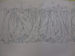
Heres my template for how I want my trees to look for my wonderful tree pan. The pan is 5 fields long which means the paper and art work will end up being around 3 and a half feet long. The first chunk will be just photo copied and added on to the end so that it hooks up and could be looped endlessly without a break.


Thursday, November 18, 2010

Vehicle Paint

We had a project recently in our Digital Tools class where we needed to design and paint a vehicle of some sort with reflective qualities. The concept had to be our own and not a copy from an existing vehicle.


Unfortunately I lost the file of the first sketch which made me try to redesign it from memory in this sketch. This was actually helpful because I was able to keep the interesting stuff I could remember but keep an open mind about everything else and how it would work together seeing as I couldn't remember all of it. The red line box is to help with perspective so parts don't get wonky or start to skew.


Next was colour, this isn't meant to actually be a Halo Vehicle, I just really like the colour scheme so I tried it out. The red was added later but on this layer just so it would look like faded design stripes or markings. I'm fairly notorious for painting on the wrong layer in photo shop, as you can see there are some highlights on the darker green area which was meant to go on my highlight layer. This isn't the biggest issue but it is something I'm trying to work on so I can organize my layers better and have more accurate process work.


Next was to lay down a gradient background which will eventually be reflected on the surface of the vehicle itself. I also added a few shadows so I could tell where planes were changing and get a bit more depth.


This is a fairly big step forward seeing as some of process stuff happens all over the place. There are now highlights and some rough ideas of reflected light


And here is the final, more details, more colour, more everything.


I'm generally happy about it I think the reflective quality is there but I regret not having something in the background that would have made the reflection more obvious. I tried to add in a bit to suggest that there could be something off to the left but now it seems to muddy it up a bit. I'm glad I decided to change the wing colour to red, because the green was a bit too over powering.

I like the sense of depth I got and the glowing quality from the power ball, but if I come back to this and repaint it I'll try to make the reflection more clear and the finished product more clean.